#Enschedé type foundry
Explore tagged Tumblr posts
Text


Typography Tuesday
We've just acquired a small group of type display books to add to our typography collections. Among them is this 1916 Dutch specimen book, Letterproef der Lettergieterij "Amsterdam" Voorheen N. Tetterode (Letter proof of the Letter Foundry "Amsterdam" Formerly N. Tetterode). The Amsterdam Type Foundry (Lettergieterij Amsterdam) was founded by by Nicolaas Tetterode (1816-1894) in 1851. The business was carried on by his son (also named Nicolaas), and soon after his death in 1912, the firm was renamed Lettergieterij Amsterdam (1914). Aside from the historic foundry of Joh. Enschedé, Lettergieterij Amsterdam was the only other major type foundry in the Netherlands throughout the 20th century until rights to its typefaces were transferred to Linotype in 2000.
Shown here are some examples of their fancy initials (fantasieletter) and a few of their cuts and type ornaments.
View our other Typography Tuesday posts.
#Typography Tuesday#typetuesday#Amsterdam Letter Foundry#Lettergieterij Amsterdam#Nicolaas Tetterode#Letterproef der Lettergieterij “Amsterdam” Voorheen N. Tetterode#type display book#type specimen books#type specimens#Dutch typography#Dutch type#initials#type ornaments#20th century type
109 notes
·
View notes
Text
Research - Type Design
1600–1650
Baroque and rococo aesthetic trends, use of the pointed-pen for writing, and steel engraving techniques effected a gradual shift in typographic style. Contrast between thick and thin strokes increased. Tilted stressing transformed into vertical stressing; full rounds were compressed. Blunt bracketed serifs grew sharp and delicate until they were fine straight lines. Detail became clean and precise.
Transitional roman types combined the classical features of lettera antiqua with the vertical stressing and higher contrast between thick and thin strokes characteristic of the true modern romans to come.
The roman types used c. 1618 by the Dutch printing firm of Elzevir in Leyden reiterated the 16th-century French style with higher contrast, less rigor and a lighter page effect. After 1647 most Elzevir faces were cut by the highly regarded Christoffel van Dyck, whose precise renditions were regarded by some experts at the time as finer than Garamond's.
1650–1700
1670–1672 for use by the Oxford University Press. The so-named Fell types, presumed to be the work of Dutch punchcutter Dirck Voskens, mark a noticeable jump from previous designs, with considerably shorter extenders, higher stroke contrast, narrowing of round letters, and flattened serifs on the baseline and descenders. The design retained a retrogressive old-style irregularity, smooth modeling from vertical to horizontal, and angled stressing of rounds (except a vertically stressed o). Fell capitals were condensed, even-width, with wide flattened serifs; all characteristics of the definitive modern romans of the late 18th century. Fell italic types were distinguished by high contrast matching the Fell romans; wider ovals; a split-branching stroke from the stems of m n r and u; and long, flat serifs—prefiguring modern. They repeated the non-uniform slant of French models, and the capitals included swash J and Q forms.
1700–1750
The first major figure in English typography is reckoned by type historians to have ended the monopoly of Dutch type founding almost single-handedly. The gun engraver-turned-punchcutter William Caslon spent 14 years creating the stable of typefaces on the specimen sheet issued in 1734. The complete canon included roman, italic, Greek, Hebrew, Arabic etc. Caslon's Great Primer roman and English roman were retrogressive designs that very closely followed the Fell types and the roman of Miklós (Nicholas) Kis c. 1685 falsely attributed to Anton Janson. Caslon's slightly bracketed serifs and old-style irregularity were not novel, but a precise cut and perpendicularity gave legibility to the forms. Caslon's italic structures follow the Fell italics, but at a condensed width and with conventional branching from stems.
Joan Michaël Fleischman (1701–1768) was born in Nürnberg where he trained as a punchcutter. He found employment with Dutch type founders in Holland and settled there c. 1728. At the Enschedé foundry in Haarlem he cut punches for a large amount of material. Some time after 1743 he produced a distinguished roman design—related to the preceding transitional types but departing from them. It prefigured modern romans with sparse transaxialmodeling, joining the vertical stressing to hairline thins and ball-ends. Fleischmann borrowed from the general mode of Phillipe Grandjean's and Louis Simonneau's "Romain du Roi," commissioned by Louis XIV in 1692 for the Imprimerie Royale, but did not imitate that face. Fleischmann's capitals were a new variety; an even-width scheme, compressed rounds, all-vertical stressing, and triangular beak ends of E F L T and Z, all characteristics prefiguring the "classical" moderns of Bodoni and Didot. Fleischmann's italic bore some resemblance to Granjean's but had longer ascenders and followed the established Dutch structures for h v and w.
1750-1775
About 1751, John Baskerville, having found financial success in producing goods from sheet metal, moved into the printing business. His roman and italic types appeared later than Fleischman's but are considered transitional and partly retrogressive with a return to lower contrast, smooth transaxial modeling, finely modeled bracketed serifs, and long stems. The exquisite design and finish of Baskerville's roman however, combining elegance and strength, was modern. His roman design, and especially his italic, were rococo-influenced. His letterforms are an intentional transition between old-style forms and modern styles. They were informed by his prior experience as a writing master and the influences of his time. The types of Joseph Fry, Alexander Wilson, and John Bell closely followed Baskerville, and through his correspondence with European type founders Baskerville's influence penetrated most of western Europe. Baskerville was a meticulous artist who controlled all aspects of his creation, devising more accurate presses, blacker inks and paper sealed with hot rollers to ensure crisp impressions. Of particular note, the lower storey of his lowercase g does not fully close. Derivatives of Baskerville are often identified thus. A modern revival of Baskerville, a font called Mrs Eaves, is named after Baskerville's mistress-turned-wife Sarah Eaves, the widow of Richard Eaves.
1775–1795
The Spanish designer Joaquín Ibarra's roman was influenced by Baskerville, Didot and Bodoni, but hewn nearer to old-style and used in the same classical manner, including spaced capitals. In England modern romans resembling Bodoni's were cut for the printer William Bulmer c. 1786 by the punchcutter William Martin, who had been apprenticed to Baskerville and influenced by him. Martin's italic mirrored the open-tail g and overall finesse of Baskerville's.
1795–1820
In Britain and the United States, modern romans (emerging around 1800 and totally dominant by the 1820s) took a somewhat more rounded, less geometrical form than the designs of Didot and Bodoni; an obvious difference is that in Anglo-American faces the upper-case C has only one serif (at the top) whereas in European designs it has two.
1820s
In Britain and the United States, modern romans (emerging around 1800 and totally dominant by the 1820s) took a somewhat more rounded, less geometrical form than the designs of Didot and Bodoni; an obvious difference is that in Anglo-American faces the upper-case C has only one serif (at the top) whereas in European designs it has two.
1830-1910
The 19th century brought fewer stylistic innovations. The most notable invention was the rise of typefaces with strengthened serifs. Forerunners were the so-called Egyptienne fonts, which were used already at the beginning of the 19th century. Their name likely comes from the enthusiasm of the Napoleonic era for the orient, which in turn was started by Napoleon's invasion in Egypt. In fact slab-serif fonts (e. g. Clarendon from 1845) were newspaper fonts, whose serifs were strengthened in order to prevent damage during the printing process. Stylistically the serif fonts of the mid-19th century appeared very robust and otherwise had more or less neo-classical design features, which changed during the course of time: By the application of the slab serif design feature and by appending serifs to more and more typefaces, an independent intermediate group of heterogeneous fonts emerged during the 20th century. Meanwhile, the slab serifs are listed as an independent group in most typeface classifications—besides both main groups serif and sans serif.
Slab-serif and sans-serif types were rarely used for continuous bodies of text; their realm was that of advertisements, title-pages and other attention-catching pieces of print. By about 1820, most western countries were using modern romans and italics for continuous texts. This remained true until the 1860s, when so-called 'old style' faces—a largely English-speaking phenomenon—came into use. These went to the opposite extreme from the modern faces; 'thick' strokes were attenuated, and serifs at the end of thin strokes (as in C, E, L and T) were narrow and angled whereas in modern faces they were broad and vertical or nearly so. All the upper-case characters were somewhat 'condensed' (narrowed). Old style faces remained popular until about 1910.
Above all the 19th century was innovative regarding technical aspects. Automatic manufacturing processes changed the print as well as the graphical illustrations. The illustration of printed matters could be considerably standardised due to the lithography technique invented by Alois Senefelder. Finally, another invention was photography, whose establishment at the end of the 19th century led to the first halftoning and reproduction procedures. The step-by-step development of a modern mass society provided a growing demand of printed matters. Besides the traditional letterpress beginnings of a newspaper landscape as well as a broad market for publications, advertisements, and posters of all kinds appeared. The challenges had changed: since printing and typography had been a straightforward craft for centuries, it now had to face the challenges of an industry-ruled mass society.
1920-1960
A result of the industrialisation process was the unimagined number and distribution of new typefaces. Whether digital variants of Garamond and Bodoni or new contemporary type designs like Futura, Times, and Helvetica, nearly all currently used typefaces have their origin either in the following and ongoing digital typesetting era or are based on designs of this epoch. The basis was the appearance of large type foundries and type manufacturers. The result: Successful typefaces could quickly gain the status of a trademark—and therefore were able to assign a unique "branding" to products or publications.
Chicago contributed much to typography design at this time as Frederic Goudy, designer of 123 typefaces, founded several presses. Oswald Cooper, designer of Cooper Black studied under Goudy
During the 1920s, typographers in central and eastern Europe experimented with forms of avant-garde typography. The main places of development of avant-garde artists had been: Budapest, Zagreb, Belgrade and, after 1924, also Prague. However, since 1925 avant-garde typography had been spreading to the cities of western and eastern Europe and, as a result, the previous cities gradually lost their relevance.
In 1924 two exhibitions important for development of avant-garde typography were organized: one by Ljubomir Micić (the First International Zenitistic Exhibition of New Art in Belgrade) and the other by Ion Vinea and Marcel Iancu (the First International Exhibition Contimporanul).
1960s
The 1960’s birthed one of the most influential typefaces that shaped visual communication around us today in branding, advertisements, and environmental signage. Helvetica was created by type designer Max Miedinger in 1960. During the postwar era, companies were looking for ways to differentiate themselves from other brands and create a new identity. The clean, bold design was created to reflect the modern and industrial times that they were in, making it legible and quick to read on the go or just passing by. For example car brands like Ford, Chevrolet, and Chrysler used Helvetica in their advertisements to promote new cars and technology. Communication was the key aspect in the design of Helvetica, and now is a common standardized choice for typography in advertisements and branding all over the world. We can see Helvetica in many major brand identities and logos such as American Airlines, North Face, American Apparel, Microsoft and Target.
The psychedelic era also had a large impact on typography and branding in the 1960’s. Art Nouveau was a decorative art style that consists of organic and elaborate lines created in the early 19th century, but was brought back to popularity in the 60’s during the psychedelic era. Designers were inspired by the past, in hopes of a better creative future, they merged elegance and sophistication of Victorian art; floral print playful lines and aesthetics combined with intense, high contrast colours. Artists wanted to break away from the post war era of the strict, uniformed designs (Helvetica) and create a playful and fluid design. This style was used on posters, signage and album covers, we can now see them in the way companies design their logos and packaging.
1970s
Graphic design in the 1970s was all about bright and clashing colors with balloon like letter forms. It was as if the serif fonts of the 60s got eaten by the rounded typography of the decade. However, the psychedelic rock concert posters remained and added to the bright and glorious 70s. Bell-bottoms and disco ruled the decade. Some hated it, others feel nostalgic about it. Either way, graphic design in the 1970s got to be experimental. Everyone was playing with different styles and types. It was a playful and memorable time for everyone.
1980s
Predominantly though, the 1980’s offered futuristic type styles with modern effects and colourful aesthetics.
80’s font were heavily influenced by the advancement of technology. These styles in particular have a futuristic style commonly using either neon aesthetics, gradients and a mirrored sheen effect. These fonts tended to have an almost overdone style, with plenty of distinct layering and over the top text effects – neon, multiple colors, glow spots. The 80’s has a certain nostalgic feel to many as it was a staple in history or their childhood to witness the development of technology, which was a catalyst for modern typography
1990s
90s Typography was the sexy thing for graphic designers to get into. Émigré was in full swing, Neville Brody was an 80s superstar, Raygun magazine rose and fell.
Be expressive, Look back, Craft, Look forward, Reinvent, Become invisible, Be Honest, Order, Look Sideways, Be Vocal,
2000s
The first trending font of the new millennium (arguably) was Gotham.
2010s
While the first web font was actually made in late 1997, it wasn’t until 2009 that the Web Open Font Format (WOFF) was developed and added to the W3C open web standards. It took another 4 years for all major browsers to adopt and support WOFF allowing to really customize websites as we could print pieces. As the second decade progressed, with it came a flood of geometric sans serifs - those without serifs or contrast in stroke width.
In the early years of the new decade, there was a renewed interest in uncluttered geometries, a trend that had appeared a few years earlier with the spread of linear typefaces such as Gotham, and that propelled typefaces such as Akkurat and Circular to popularity towards the mid-decade.
Alongside technological innovations, an elemental, minimalist style of typography developed, linked to digital aesthetics, which replaced all elements of traditional ornamentation, considered as superfluous or even problematic.
One of the most important reasons for this return to minimalism was the need for greater legibility, fundamental in a world in which most content is accessed through the screens of smartphones or even smaller devices. This was keenly felt by Apple, to the point that, specially for the Apple Watch, the company launched “San Francisco”, a typeface that successively became standard for all products by the Cupertino-based company.
At the same time, from the mid-2010s, there was a powerful interest in more experimental forms of typeface. This trend was made possible by the introduction of user-friendly software such as “Glyphs”, which enabled increasing numbers of designers to enter the world of type design, and fuelled an increase of typography’s popularity on social media. Good examples include viral projects such as “36 Days of Type” which over the course of 6 years collected over 670,000 participants.
Typographical experimentation has also included the redesign of historic, classic typefaces. It is no coincidence that the last decade saw an increase in popularity of the Didone family, typefaces of French inspiration that emerged in the 18th century, and that were given new interpretations compliant with the needs of new technology.
2020s
In the 2020s type has taken in all trends and elements from previous eras whilst adding a touch of modernisation to create unique type styles.
0 notes
Photo

caxton
«Printing [typography] was introduced in England in 1476 by William Caxton, who owes his fame, however, to more than the fact that he was England’s proto-typographer. For he was not only the first of English printers—he was also ‘the first in a long line of English publishers who have been men of letters … and was likewise one of the earliest in the succession of English merchants and men of affairs who have found recreation and fame in the production of literature’.» [d.b. updike, Printing Types, vol. 1, oxford university press, 1937, p113; updike is quoting from a paper by george parker winship: William Caxton, doves press, 1909]. it is a misnomer referring to caxton as printer—conjures images of setting type & pulling prints: he was a printer in the sense that he owned a printing establishment; but his press was for him a means to effect trade—he was his whole life a professional merchant. severin corsten in his paper «Caxton in Cologne» gives strong argument, deduced from the misty history surrounding caxton’s acquisition of the black art, that the city of cologne occasioned caxton’s close study of this new technology while seeing an edition of bartholemew’s De Proprietatibus Rerum through the press in johann veldener’s printing office (veldener had learned the art in the office of ulrich zell—cologne’s first printer); caxton may have also materially participated in this publication [Journal of the Printing Historical Society, No.11, 1975/6]. caxton set up his first office at bruge in 1472, where he issued the first printed, english language book in 1474, his first literary translation, Recuyell of the Historyes of Troye. finally, caxton removed back to london in the autumn of 1476 with apparatus & assistant, wynkyn de worde, establishing his office within the precincts of westminster abbey.
richard deacon [donald mccormick] tells us in his interesting book William Caxton the First English Editor [frederick muller, london, 1976, p92]: «It is clear that Caxton had a passion for the English language, for developing it and for changing it from a hotchpotch of dialects to a cohesive, expressive force.» caxton lamented the kentish weald dialect of his upbringing: «He was for ever striving after changing what he called ‘the rude and old Englyssh’.»* [ibid., p55]. deacon’s book is set throughout in monotype van dijck [english monotype 203]—inspiration for setting caxton’s locution in monotype’s digital reissue of van dijck italic. monotype van dijck italic is jan van krimpen’s 1937-8 adaptation of the Augustijn Romeyn italic cut by christoffel van dyck, as shown on the 1681 specimen issued as a sales catalogue by the widow of daniel elsevier, in amsterdam [stanley morison, A Tally of Types, cup, 1973, appendix p113 ]. the punches for van dyck’s founts passed down by sale through several foundries, finally again reuniting in 1799 in the famed amsterdam foundry joh. enschedé en zonen [ibid., p115].
digital print [toner] on cartiera amatruda amalfi.
*full context: «[I] somwhat have chaunged the rude and old Englyssh, that is to wete certayn wordes which in these dayes be neither usyd ne understanden» [cf. n.f. blake, Caxton and his World, andre deutsch, london, 1969, p181].
#english#literature#typography#caxton#typesetting#johann veldener#christoffel van dyck#jan van krimpen
3 notes
·
View notes
Text
“Knights” Binding
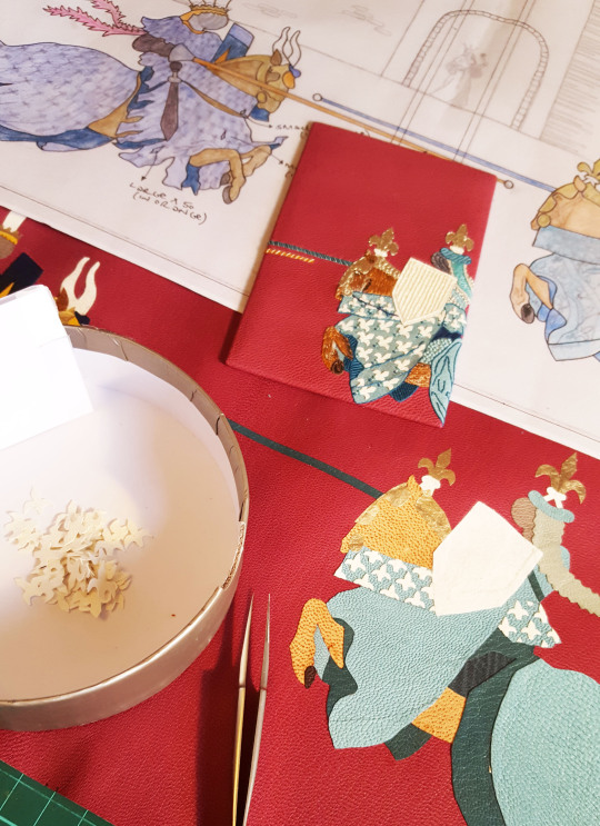
Sorry for the blog silence, I've just moved house (no mean feat with two under twos!) and I am now living in Bristol. This is a stop gap on our way into Somerset and country life, we have downsized and therefore my studio is temporarily residing in a storage unit down the road.
I am taking an enforced break from the physical act of bookbinding in order to take care of Ivy and Winnie (however it is impossible to switch my creative thoughts off during this time!) and I hope to take this opportunity to also catch up with the digital side of my life. For months I have been meaning to sort out my computer as have about a million baby photos to sort through, files duplicated numerous times and/or in the wrong order, photo editing to do for my website as well as numerous other onerous tasks.

I am also due to take on a new role come September, I will be the Project and Events Manager (PEM) for Designer Bookbinders so want my files to be in order before then. The PEM is the switchboard for information coming in from DB members and going out to the public. I therefore need to be completely up-to-date with all DB and other select bookbinding-related activities including dates for meetings, workshops, fairs and competitions. I will be responsible for publicising the above whilst trying to gain a stronger international presence for the society - watch this space for further updates on the role once I get started!
Before moving I managed to complete two bindings, it was great to draw a line under these before packing up my workshop. These were two books that unfortunately got delayed by my two pregnancies and although were started many (many) months ago laid dormant for quite a while. I am very thankful to my clients for being so patient and understanding during this time and was pleased to be able to hand over both in person before leaving London. The final task with regards both of these bindings is to write a blog post about each starting as follows...
The first of these bindings was an 1956 Allen Press publication of, “The Noble Knight Paris and Fair Vienne”. The book is a romance of thirteenth-century France which was regarded as the most popular story of medieval times.
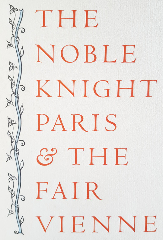
Inserted into the original book was a promotional leaflet about the publication from 1956, with details about the text block as follows:
_______________________________________________________________________
ANNOUNCING A NEW BOOK
The Noble Knight Paris and the Fair Vienne, Translated out of French by William Caxton
This edition, limited to 130 copies, has been produced by hand and is being published by the Allen Press, the private press of Lewis and Dorothy Allen, Kentfield, California.
The text of Paris and Vienne is a romance of thirteenth-century France, and was regarded as the most popular story of the middle ages. Although often copied in manuscript, and frequently printed in the fifteenth and sixteenth centuries, there are few romances so rare as this one. From the original Catalane language, it was translated into Latin, French, Flemish, Italian and English. A noted seventeenth-century critic stated that “it would be impossible to find a work more fitted to imbue the mind with correct taste and elegance of style, or to influence character by the wisdom of its reflections, or to forearm hearts against those assaults of fiery passion which blindly precipitate one into the abysses of misery. The work is truly admirable. The situations are so interesting and the dénoument is so happy, that their conception would reflect honor on the best writers of the most renowned ages.”
The only known copy of Caxton's printing (1485) is in the British Museum; the present edition is based on that copy.
The Allen Press is pleased to offer this important and delightful romance in a hand-made book of the finest materials and craftsmanship. The book was set by hand in the handsome Romanée types designed by Van Krimpen for the Enschedé foundry in Holland. The paper (printed damp) we believe to be the most distinguished sheet produced in modern times. It is named Val de Laga, and is from the Richard de Bas mill in France; this mill has provided hand-made paper continuously since 1326. When we wrote to the manager in Paris to question the high price, the reply was this, “Unfortunately, you have correctly heard the price of our fine paper. I do not know how expressing myself, but our old mill is not a 'commercial affair,' it is a 'thing of beauty' as said Keats, and our paper costs to us much than we sell it (we make only three hundred sheets a day!). That mill was founded in 1326 and we have no changed the process of fabrication. Every sheet costs much time: that is why it is dear and beautiful as not other one.”

The book was printed on Acorn-Smith handpress which was made in Philadelphia about 1830. On every page there are wood engravings by Mallette Dean; each (122 per book) has been hand-coloured by Dorothy Allen. There are approximately one hundred pages, 11 by 8 inches. The binding consists of an Invicta parchment spine, and sides of French paper decorated with wood engravings. The books are enclosed in slip-cases covered in the paper of the binding,
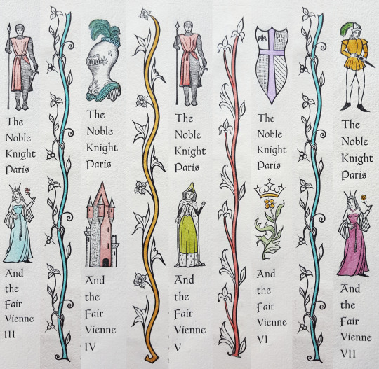
The publication date is May 15, 1956. On advance, PREPAID orders, a special price of $18.50 has been set. After May 15, the price will be $20.00. Because there are only 130 copies, we respectfully suggest that orders be mailed promptly.
The Allen Press 516 Woodland Road Kentfield California
_______________________________________________________________________
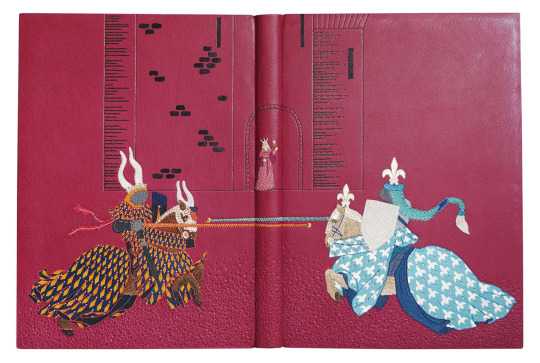
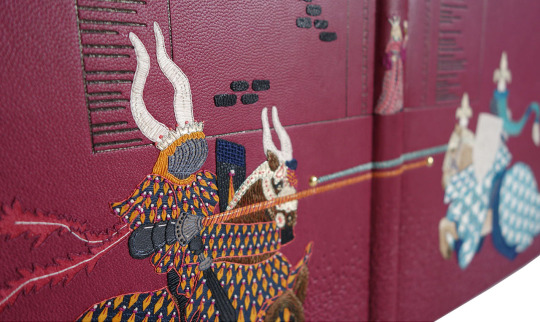
The book is a love story and I was taken by the idea of Paris the Knight jousting against his rivals for the admiration of Vienne. I thought that this would create a strong design and I could place the characters so that they would mirror well across the cover; Paris appearing on the front cover and his rival on the back with the jousting poles crossing the spine.

Quoted from the text, "Alle other knightes there were knowen by their armes, but the two white knights were unknowen...Said Vienne, yonder two white knightes that bear no armes on their sheldes are more to my fantasie".
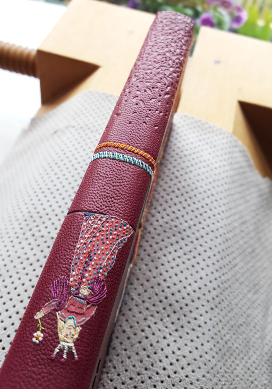
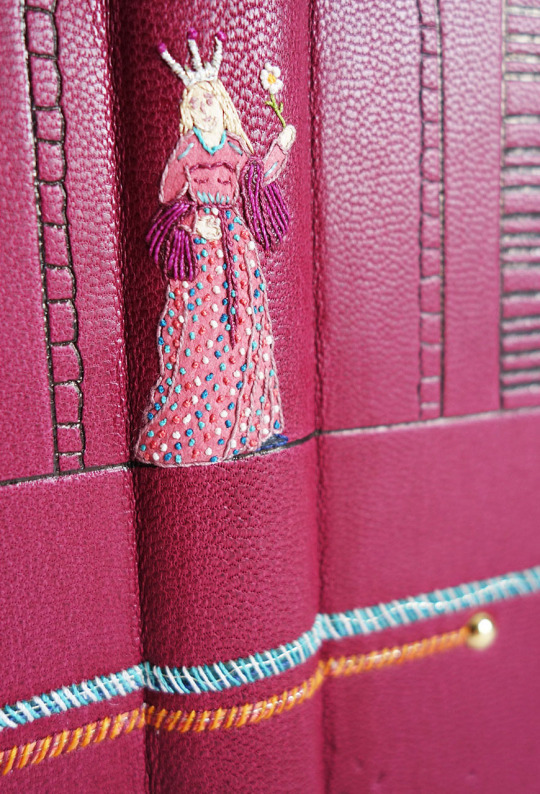
Paris bore no arms on his shield therefore I decided to depict him with a plain white shield - in the story he goes on to win a crystal shield and a gold garland of flowers, presented to him by Vienne. On the cover design I drew her on the spine section - the same image as that taken from the wood block print in the text block. I placed her standing in the doorway to her castle, the castle being a much larger version of the wood block print that also features in the text block. The outline of this castle I planned to carbon or blind tool, with Vienne embroidered in colour.
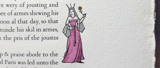
When it came to choosing the colour palette, the wood block prints in the text block were hand-coloured in pastel tones so I wanted this to follow through into the cover design. I had a lovely pink/purple Pergamena skin in my leather drawer that I chose to cover the book in and selected the leather onlays to go with this.
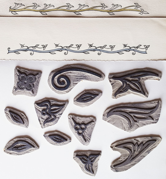
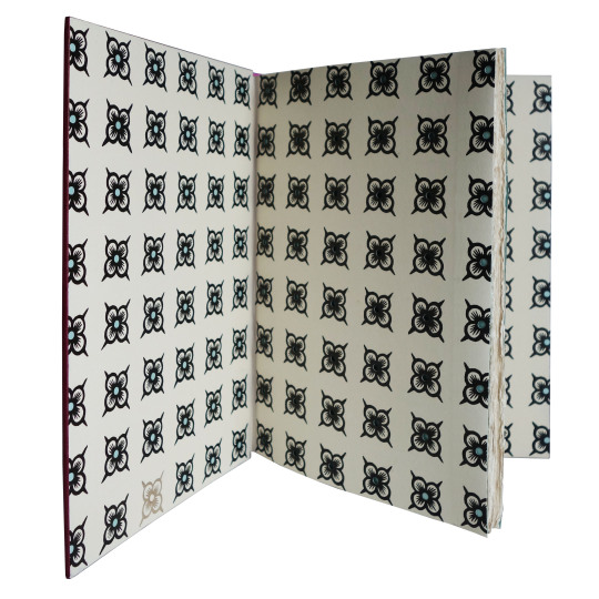
The woodblock prints were also my inspiration for the endpapers and doublures. I used the leaf and floral elements from the illustrated vines to carve some lino stamps, much larger than the originals.
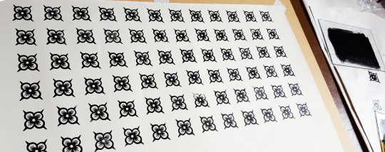
I didn’t originally have a vision about the pattern I was going to print these in so did some tests using an ink pad and some paper. It turned out that using all of the stamps together appeared too fussy so in the end I used just one to create a gridded repeat pattern. I felt that this worked better with the cover design, as the fabrics of the horses were repeat patterns too.
I used an oil-based ink, Intaglio Printmaker Black Litho/Relief Ink, for the printing. These inks are recommended for block printing but are slow drying so I had to do this a few days ahead of the forwarding.
Given the leaflet that was included with the text block detailed the quality of paper used for the original binding I felt it important to get something as close as possible to that for the endpapers and doublures. I took one of the sections into Shepherds in London and found a very suitable match, both in weight and colour:
Ruscombe Mill 1840's Wove - 110gsm (RM184W11)
“This range was conceived to match European papers. These papers are available in 65 & 110 gsm and are made in both laid and wove versions. The papers are manufactured from cotton and flax, have four deckle edges and conform to archival standards.”
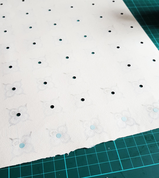
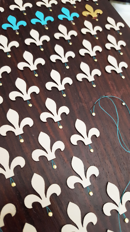
Once the ink was dry I punched out the centres of each of the flowers with my Japanese hole punch and stuck a circle of coloured paper, slightly larger in size, to the reverse of the hole with some PVA.
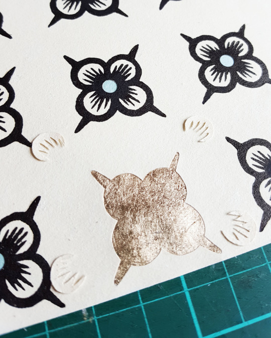
I also chose one flower on both the front and back doublures to back with gold leaf. Firstly I carefully pierced around the outline of the flower and then backed the hole with Moon Gold leaf that I had adhered to Japanese tissue in advance. This really caught the light and added a satisfying visual change in comparison to all the other black flowers.
Once the endpapers were made up and sewn to the text block the book could be rounded and backed with a backing hammer. The spine was then lined with linen, leather and a hollow. The text block had deckled edges on the foredge and bottom of the pages which I kept but I sanded the top edge flat.
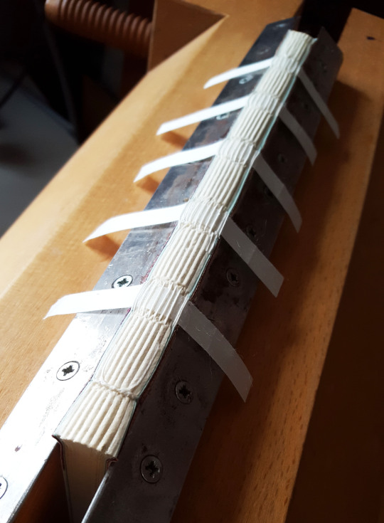
Once the book had been rounded and backed I sewed the endbands with colours to match the cover design and then laced on the boards. At this point it was possible to mark out the exact size of the book and cut the leather (yes, that is a newborn baby in the sling asleep whilst I work!).

As with all of my bindings I make a sample board ahead of working on the book leather to test out colours and stitches (this board comes in at number 50!). On a photocopy of the cover design I spent a while working out a colour chart for my onlays. Unless they really are too tiny to do anything with I rarely throw any of my leather scraps away so I have boxes of odds and ends to work with - perfect for a job such as this.

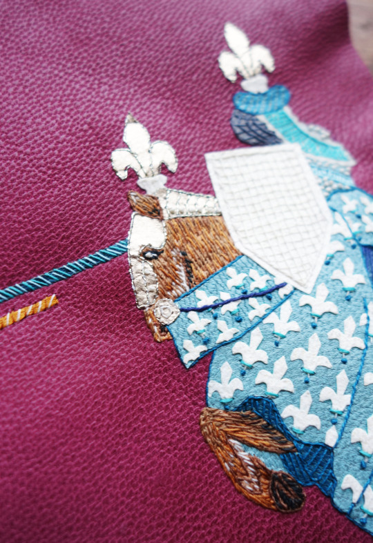
I first set about sticking onlays down onto the sample board leather. This included some alum-tawed leather for the white of the shield and fleur-de-lis on the cloak of the horse.

I also used some of the Moon Gold leaf I had stuck to Japanese paper for the head pieces of the knight and horse.

Once these were stuck down and the onlays back-pared I was able to start on the embroidery. I used a combination of different stitches to build up the design, pricking through the leather with a bodkin into some foam so I then knew where to place the stitches.

The embroidery stage of the binding is the bit I enjoy the most, in fact I find it quite therapeutic. It was also quite possible to achieve whilst sitting with a sleeping baby on my lap!
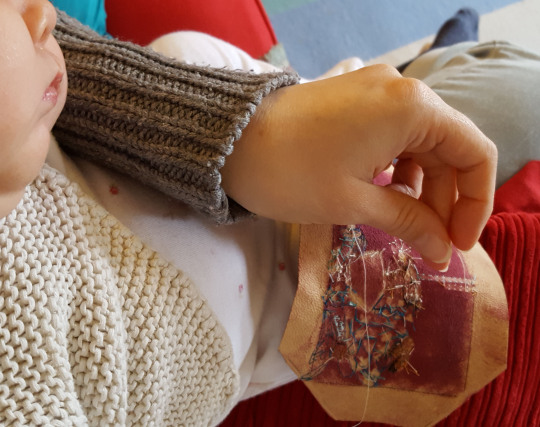
The white alum-tawed leather of the shield was given some texture with cross-hatched stitches in a thread of the same colour. I also built up the fur of the horse using small stitches in a variety of colours.
Once the embroidery was complete it was then time to stick it to the sample board. I always find it interesting to observe and capture the back of the piece before it goes onto the board/book as it will never be seen again!

It was then time to work on the leather for the actual book starting with glueing down the onlays. To ensure I get these in the correct place I work through a tracing paper template that I stick in place on top of the leather so it can be lifted up and down whilst adhering down the small leather pieces.

I worked on the larger block pieces first, building up the onlays layer by layer as I go trying to ensure there is not too much of an overlap between each piece.
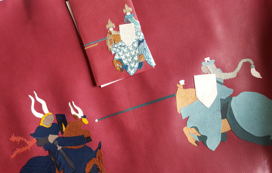
Once the larger pieces were down it was time to cut out and stick down the smaller onlays to make up the pattern of the outfit material of the horses and the knights.
Lots and lots of tiny onlays later.....

...the glueing was done and they were stuck down in place. I cut out three different sizes with the smallest glued at the top and the largest at the bottom.

And finally the onlays for Vienne were added to the spine.

The leather could then be pared. Firstly the edges were first run through a Brockman down to 0.4mm and then the “step” was taken off using a French paring knife. The main body of the leather was then back-pared using the knife, ensuring I vacuumed away the leather dust at regular intervals so as not to get any trapped under the leather leading to thinner patches being pared in the wrong places.
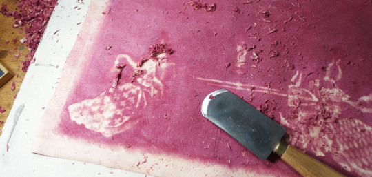
The joints of the leather where the boards were to hinge were sanded over a rounded edge to remove some of the thickness. It was then further pared in these areas when flat with my French paring knife to graduate the thickness.

I find it quite satisfying when you start to see a sort of “halo” image from the front coming through on the reverse of the leather in amongst all of the leather dust - this was the final result!
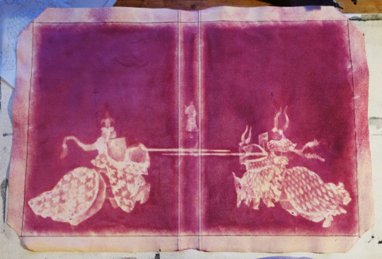
Along with my little “helper”, Winnie, the embroidery of the leather then commenced. I try and work on the outlines first and then build up the detail second, working through colour by colour. In order to access the part of the leather that I am embroidering I coil up the leather and fix it into a tube with bulldog clips at each end. The leather is too thick to use an embroidery hoop with but I find this works well and makes it more manageable.

Further to how I did the shield on the sample board I added French knots to the cross-hatching on the book cover to add a bit more textural detail. One of the main reasons I do a sample board is to help to visualise what the book is going to look like and I often embellish the actual book leather further than than of the board.

French knots and linear stitches were also added to the diamonds on horse number one.

Yet again, the back shows the random nature of the stitches in comparison to the front - how the thread passed its way around in order to create the cover detail. This will be forever concealed once the leather is on the binding...
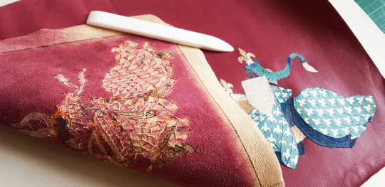
It is always a satisfying feeling to have finished the embroidery but then a slight feeling of trepidation steps in having to get it onto the binding!
The completed embroidery on the front:

The completed embroidery on the back:
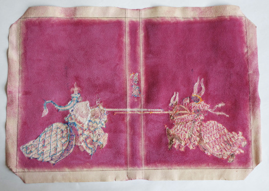
The book was then covered with the leather - definitely a stage of the process when I made sure the baby was elsewhere so as not to be disturbed during this crucial time! I dampened the front of the leather using a water spray before pasting out the back three times with paste. After covering I waited for it to dry for a good 24 hours before putting the leather joints down.

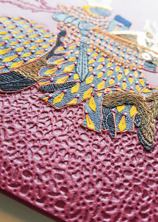
I then moved onto the tooling of the binding. The castle outline was first blind-tooled with pallets before filling in the lines with carbon. I used hand-made finishing tools to blind tool some texture beneath the horses and knights. These hand-tools often make an appearance in my bindings and have been a very useful little set to have made.
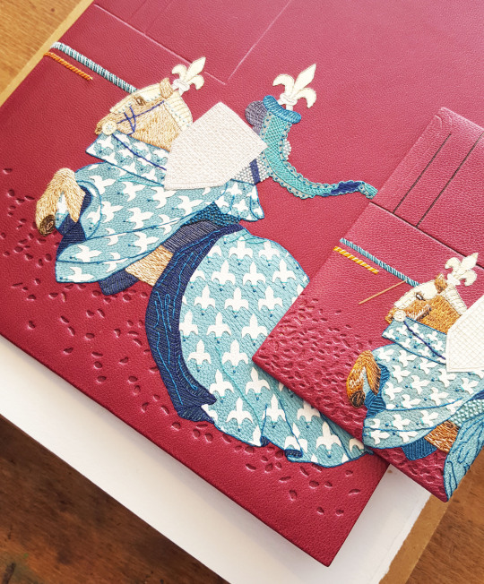
I was very pleased with how this tooling worked out, adding a visual difference to the bottom half of the leather, as shown in detail below.
A small amount of Moon Gold was also tooled onto the fleur-de-lis of the Noble Knight Paris’ horse.

And then the book was held in a finishing press in order to tool the spine.
I had visions of the box of this binding ahead of working on it. A number of years ago I bought some planks of ebony, I think they were actually being sold for instrument making. I thought that the rich, dark colour of the ebony would work really well as the container of this binding so dug it out. The planks I had weren’t quite wide enough to make a solid lid so the panels were “book-matched”:
“Bookmatching is the practice of matching two (or more) wood or stone surfaces, so that two adjoining surfaces mirror each other, giving the impression of an opened book. As applied to wood, bookmatching is usually done with veneer (produced in one of several ways), but can also be done with solid wood”. Wikipedia
I wanted to carry over the fleur-de-lis pattern from the cover design onto the box and decided a good way of doing this would be to get a series of these laser-cut. I know a wonderful jeweller called Emily Kidson who uses Formica laminate in her work. She gave me some pieces a while back to try out and this seemed a perfect opportunity to have a go with it. I also had some wood veneers in my drawers so had some cut in this too.
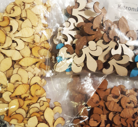
I was really pleased with how the laminate fleur-de-lis looked when I got them back and set about working on how to place them on the box lid.

I also wanted to include one gold-plated fleur-de-lis so pierced the same shape from brass sheet. I then soldered some posts to the back of it so it could be physically fixed into the box lid.
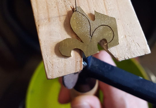
As well as the fleur-de-lis I want the jousting poles of the knights to be made from metal. I rounded the ends of some brass rod with a file, then removed the file marks with wet-and-dry paper before cutting the rod down. I then soldered these ends onto some posts - the smaller of the three circles was for the sample board.

I then had all these metal pieces polished and plated with 2 microns of gold.
The ebony was finished with Danish Oil and then a layer of bees wax. Under where each of the fleur-de-lis were to be placed on the lid I drilled some holes and pushed through brass pins.
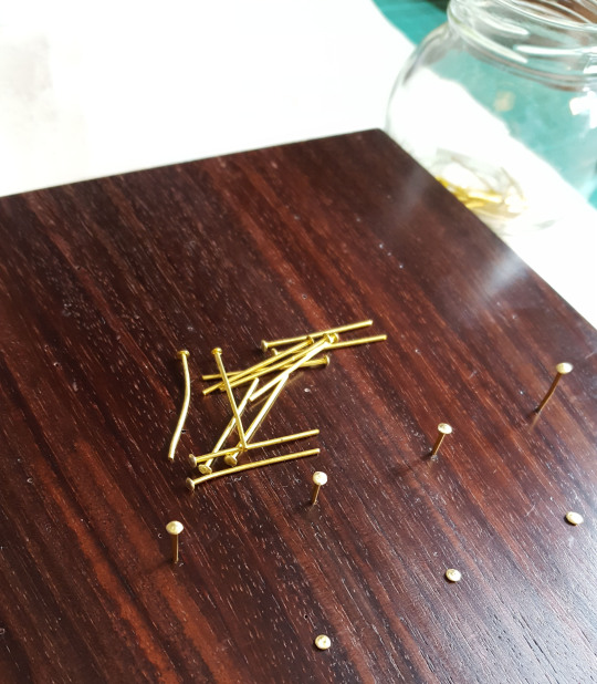
The heads of which were wound with a length of thread to add some detail with the ends of the threads being glued in place inside the lid.
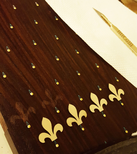
Because the box had been oiled and waxed, I needed to abrade behind where they were due to be stuck down in order for the glue to have something to bind to. I cut out a paper template of the fleur-de-lis and used this through which to score the wood with the end of a scalpel blade.

The laminate fleur-de-lis could then be stuck down with PVA, a few at a time, and a weight placed on top of the whilst the glue dried.
As a change from shop-bought catches, for this particular box I wanted to add an additional element in the form of a jousting stick to act as a clasp. I first covered some thin brass tube with Japanese paper using Lascaux Acrylic Adhesive. This glue is extremely elastic with the dry film remaining permanently tacky. It is great for adhering paper to non-porous surfaces such as metal so was perfect for the job.

Once there was a layer of Japanese paper adhered to the brass I had a suitable surface upon which to stick a leather layer to it. I first wound a strip of turquoise leather along the length with PVA and then stuck a thinner strip of purple leather on top of this around the join along the whole length.
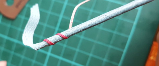
I stuck a bead on the tail end and had the “handle” end machined to my dimensions. Each of these two ends had a pin attached to it that was glued inside the brass rod. The jousting stick then had to have an tubular attachment made to be fixed to the box for it to feed through and close the container.
This was made by soldering some flat sheet to some brass tube, the inner diameter of which fitted the end of the turned brass jousting pole handle. This was then cut in two and one half of each drilled and pinned into a chiselled groove on the top/bottom of the box. When the lid was closed they married up and the jousting pole could be slid through it therefore holding the box closed. A second tube of the same specification was added a bit further down for the beaded end of the pole to sit in. These pieces were also covered in thin leather.

The box was hinged and then lined with felt, mainly to protect the book, but also to conceal the pins and thread that were visible inside the lid of the box.
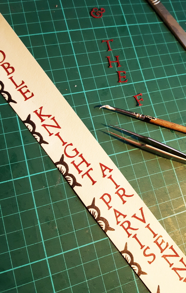
I have now made it common practice to order each of my bindings and accompanying wooden boxes a conservation grade box to be housed in. I order these from the Bodliean Library and label them so they can be identified on a book shelf. The letters for this outer box were cut from the title panel for the ebony box, therefore the offcuts weren’t wasted.
And so comes to an end the making of this binding! But not to the work surrounding it as I had to photograph and catalogue the book for my website.
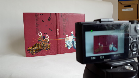
I have a new website in the making at present by my husband George therefore this will be one of the last to appear on my existing site. With that however comes a lot of work as I assess what from my old site makes the cut to the new one.
I will also be amalgamating this blog onto it so I no longer have so many different platforms to publish things on! I will however have a bit of a cross over where my posts will appear simultaneously on both for a while until the change happens for good.
I will leave you with a few select photos of the final piece in all it’s glory, for more please visit my website.
FRONT COVER:
ENDPAPERS AND DOUBLURES
SPINE DETAIL OF VIENNE:
COVER DETAIL:
BOOK IN BOX:

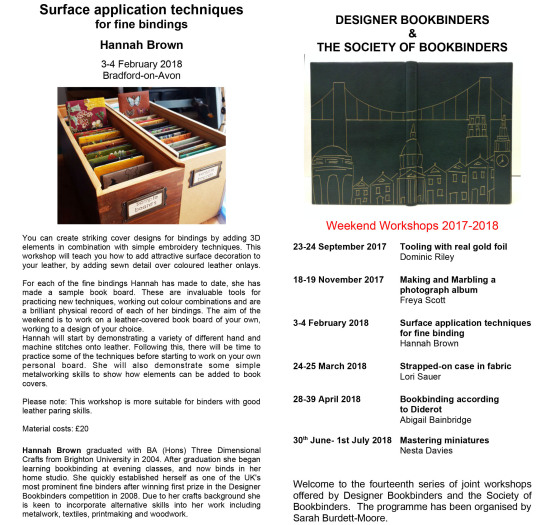
On an end note, if you are interested in making your own “sample board” I am due to teach a class for the DB/SoB joint workshops in February next year in the beautiful Bradford-on-Avon, details can be found on both the DB and SoB websites over the coming weeks.
#bookbinding#designer bookbinders#society of bookbinders#embroidery#soldering#jousting knights#knights#jousting#leather#linoprint#shepherds#ebony#bookmatched#laminate#formica#teaching#sampleboard#paring#romance#printing
43 notes
·
View notes
Text
[retypefoundry] Good news: The entire inventory of the #Enschedé type-specimen collection is now online: https://t.co/QOhHsYG0dH
Retype Foundry @retypefoundry [Retweeted by Frederik Berlaen @typemytype] Good news: The entire inventory of the #Enschedétype-specimen collection is now online: noord-hollandsarchief.nl/bronnen/archie… from Twitter user timeline feed for typemytype https://twitter.com/typemytype/statuses/1135483592824545285
0 notes
Photo
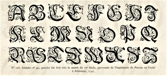
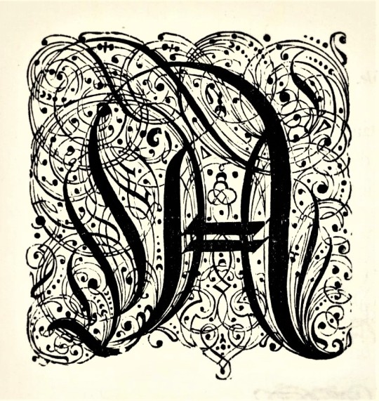

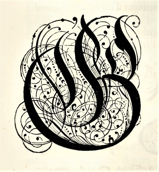

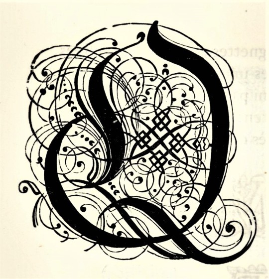

Typography Tuesday
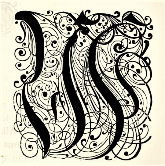
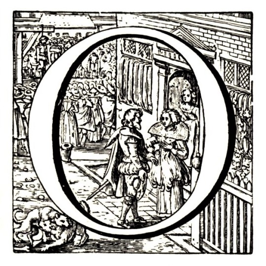
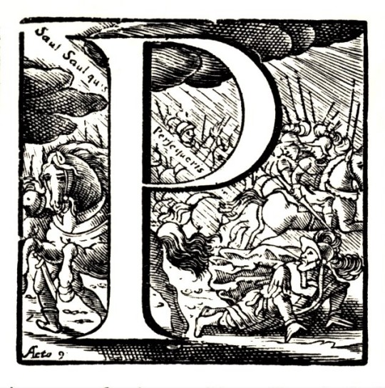
Here are some fancy, schmancy wood-engraved initials from our recent acquisition, Fonderies de caractères et leur matériel dans les Pays-Bas du XVe au XIXe siècle by Charles Enschedé (1855-1919), with specimens from the extensive typographic collection of the venerable 320-year-old printing and typefounding firm Joh. Enschedé en zonen, published in Harlem by De Erven F. Bohn in 1908.This title is one of type historian and designer Jerry Kelly’s recent One Hundred Books Famous in Typography (The Grolier Club, 2022).These highly calligraphic Gothic initials were engraved in wood in 1741 and were from the printing house of Pieter de Vries in Schiedam, Netherlands. Our copy of Fonderies de caractères is from the collection of New York artist Elijah Silverman and bears his signature.
View other posts related to the Enschedé firm.
View more Typography Tuesday posts.
#Typography Tuesday#typetuesday#Joh. Enschedé en zonen#Enschedé#Joh. Enschedé#Enschedé type foundry#Enschedé Font Foundry#Charles Enschedé#De Erven F. Bohn#initials#wood engravings#Gothic type#Typography Tuesday#Fonderies de caractères et leur matériel dans les Pays-Bas du XVe au XIXe siècle#Jerry Kelly#One Hundred Books Famous in Typography#Elijah Silverman#18th century#18th century type
118 notes
·
View notes
Photo




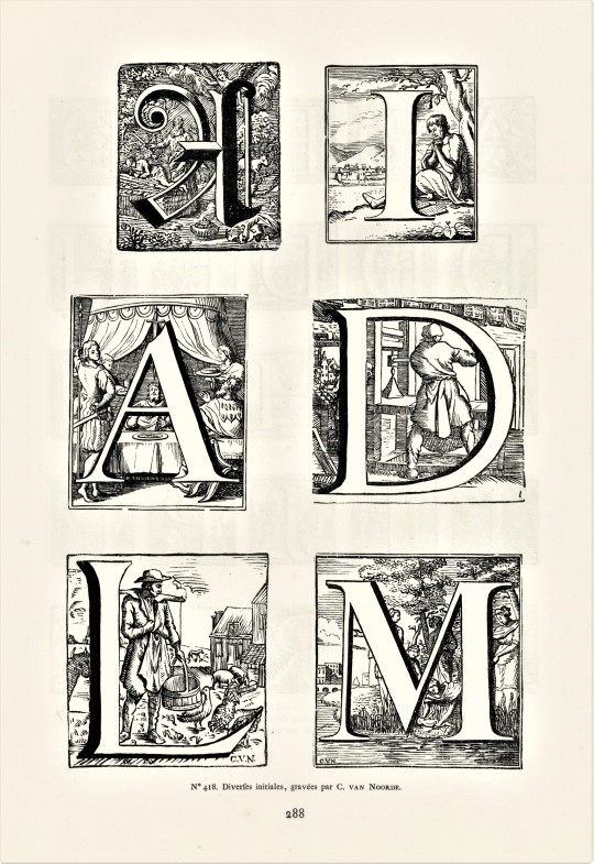
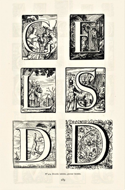

Typography Tuesday
HISTORIATED INITIALS FROM THE ENSCHEDE COLLECTON
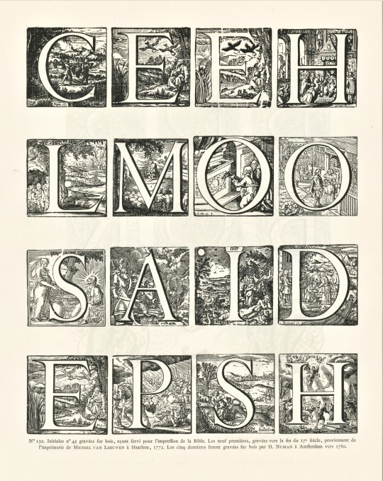
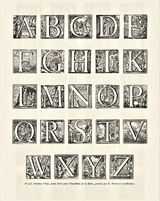
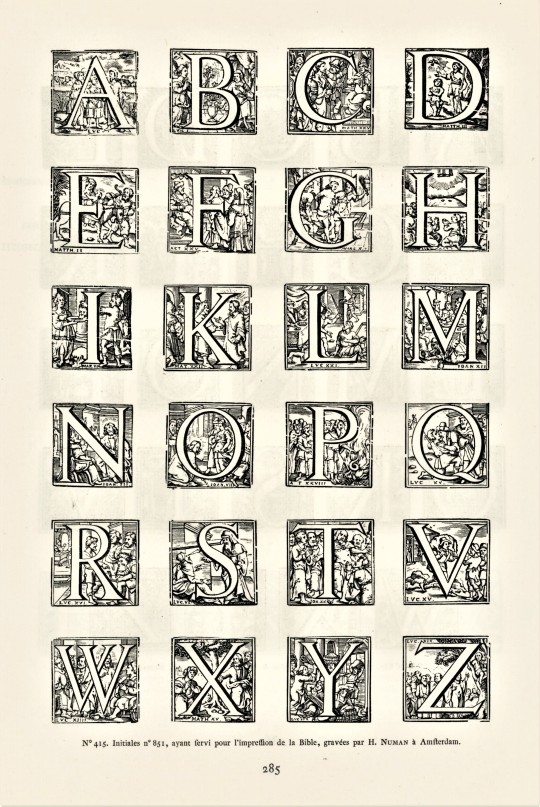
A couple of weeks ago, we highlighted some fancy-pants wood-engraved initials from Charles Enschedé‘s historical survey of Dutch types, Fonderies de caractères et leur matériel dans les Pays-Bas du XVe au XIXe siècle, published in Harlem by De Erven F. Bohn in 1908. This week we present some wood-engraved historiated initials from the 18th century. These specimens were drawn from the extensive typographic collection of the venerable 320-year-old printing and typefounding firm Joh. Enschedé en zonen. Click on the images for the engraving credits.
This publication contains nearly 5,000 type specimens including alphabets in a variety of languages, as well as ornaments. The author, Charles Enschedé, was a member of the founding family and one of the firm’s directors. He began this work in 1893 on the occasion of the 150th anniversary of the Enschedé type-foundry, taking 15 years to bring to completion.
View other posts related to the Enschedé firm.
View more Typography Tuesday posts.
#Typography Tuesday#typetuesday#Joh. Enschedé en zonen#Joh. Enschedé#Enschedé#Enschedé type foundry#Enschedé Font Foundry#Charles Enschedé#De Erven F. Bohn#initials#historiated initials#wood engravings#Fonderies de caractères et leur matériel dans les Pays-Bas du XVe au XIXe siècle#18th century#18th century type#Typography Tuesday
51 notes
·
View notes
Photo
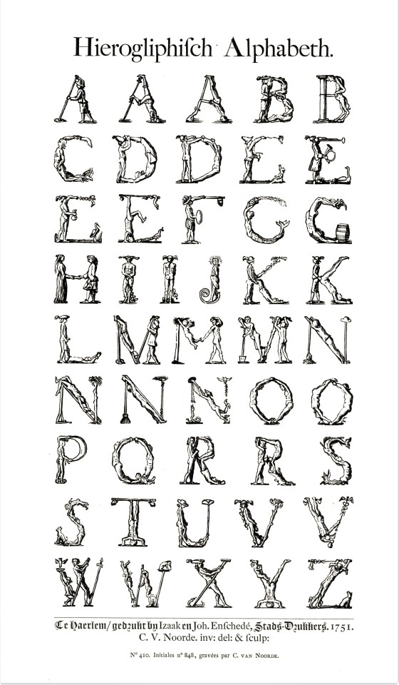

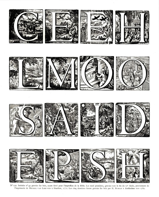

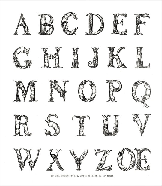
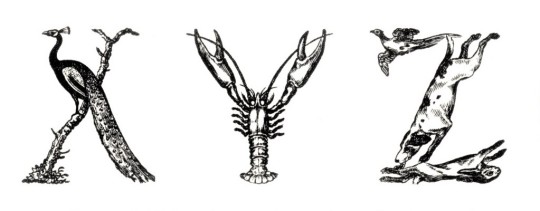
Typography Tuesday
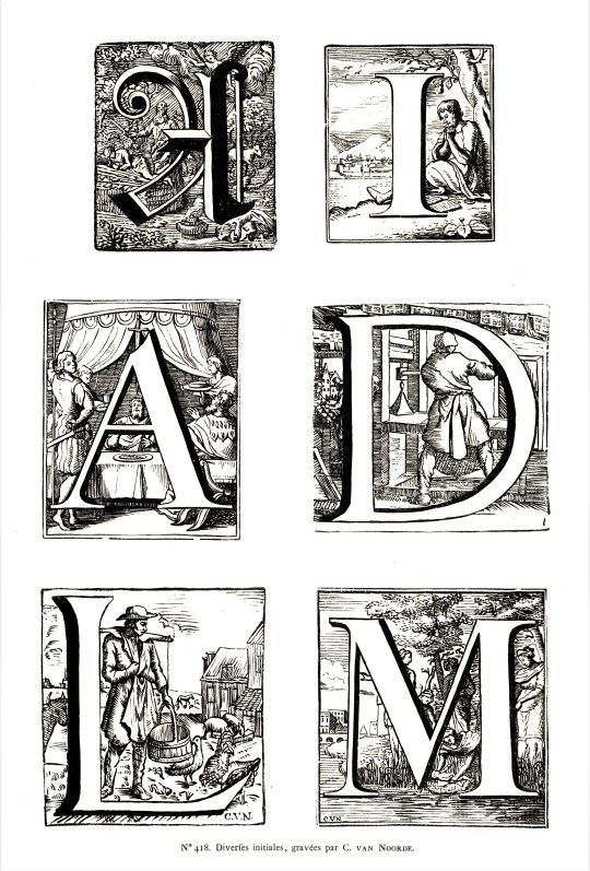
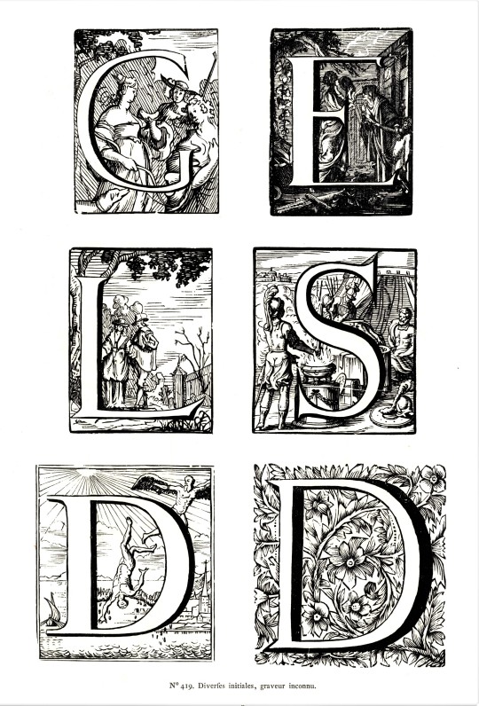
Here are some historiated initials and some initials made from people and animals (there’s probably a name for these kinds of letterforms but we can’t figure out what that is. Our department manager Alice calls them alphabetiforms; we're going with that!).These type forms are from a new acquisition on the historical typefaces of the Enschedé type foundry in the Netherlands: Fonderies de caracteres et leur materiel dans les pays-bas du XVe au XIXe siecle by Charles Enschedé, published in Haarlem by Erven F. Bohn in 1908.
This massive publication is a review of Dutch foundry type in the Netherlands from the 15th to the 19th centuries. The types documented here are from the collections of the Dutch firm Joh. Enschedé en Zonen in Haarlem, Netherlands, which was founded in 1703 as a printing establishment. At the time, the firm bought out a number of other foundries that were struggling and therefore became owners of historical types from the fifteenth century onward. The company began manufacturing its own type in 1743 and the foundry soon became the most important part of the Enschedé business, which continues to this day.
This volume contains nearly 5,000 type specimens including alphabets in a variety of languages, as well as ornaments. The author, Charles Enschede, was a member of the founding family and one of the firm’s directors, and wrote a number of works on the firm and its history. He began this work in 1893 on the occasion of the 150th anniversary of the Enschedé type-foundry, taking 15 years to bring to completion.
View our other Typography Tuesday posts.
#Typography Tuesday#typetuesday#historiated initials#alphabetiforms#Joh. Enschedé en Zonen#Enschedé type foundry#Dutch type#Charles Enschedé#type specimens#Fonderies de caracteres et leur materiel dans les pays-bas du XVe au XIXe siecle#Typography Tuesday
92 notes
·
View notes
Photo


Typography Tuesday
This week we present some lovely hand-colored calligraphic flourishes by California printmaker and illustrator Mallette Dean (1907-1975) for the opening chapters in California writer Gertrude Atherton‘s The Splendid Idle Forties: Six Stories of Spanish California (originally published in 1902) with a preface by Oscar Lewis, printed in Kentfield, California at The Allen Press by Lewis and Dorothy Allen in an edition of 150 copies in 1960. Mallette Dean produced illustrations for several California fine presses, most especially for the Grabhorn Press.
The text font is hand-set Romanée, designed by Dutch book and type designer Jan van Krimpen, cut by the influential German punchcutter Paul H. Rädisch, and released by the Enschedé type foundry in 1928. Dean’s designs also appear throughout the text, and we are particularly impressed the beautiful Romanée display initials that mark the beginning of every unquoted paragraph. Printed damp on all-rag Rives paper on the Allen’s ca. 1830 Acorn-Smith hand press, the overall impression is one of lithe elegance. Our copy of The Splendid Idle Forties is a gift from our friend Jerry Buff.
View more posts on work by Mallette Dean.
View more posts on work by Jan Van Krimpen.
View our other Typography Tuesday posts
#Typography Tuesday#typetuesday#Typography Tuesday#decorative initials#calligraphy#Mallette Dean#Jan Van Krimpen#Paul H. Rädisch#Romanée#Enschedé type foundry#Allen Press#Lewis and Dorothy Allen#Gertrude Atherton#The Splendid Idle Forties#Oscar Lewis#Acorn-Smith hand press#Jerry Buff
50 notes
·
View notes
Photo


Dutch-Foundry Feathursday Roosters
ROOSTERS!!
This past Typography Tuesday, we highlighted some fancy-pants wood-engraved initials from Charles Enschedé‘s historical survey of Dutch types, Fonderies de caractères et leur matériel dans les Pays-Bas du XVe au XIXe siècle, published in Harlem by De Erven F. Bohn in 1908. Besides surveying metal and wood types used in Dutch printing, this weighty tome also includes many pages of historic cuts used by Dutch printers.
Because we are in somewhat of a fowl mood, today we present a sampling of ROOSTERS! from Mr. Enschedé‘s selection of cuts. We’re cock-sure you’ll just crow over these fine-feathered foundry fellows. Click on the images for the engraving credits.
View other posts related to the Enschedé type-founding firm.
View more Feathursday posts.
#Feathursday#roosters#chickens#printer's cuts#type specimen books#Charles Enschedé#Joh. Enschedé en Zonen#Enschedé type foundry#Enschedé#De Erven F. Bohn#wood engravings#birds#birbs!
86 notes
·
View notes
Photo


Typography Tuesday
CHRISTOFEL VAN DYCK (DIJCK)
Although much of the life and career of Dutch type designer and punchcutter Christofel van Dyck (ca. 1601-1669) are not well documented, the influence of his type designs had a powerful impact on Dutch typefaces which were prominent in northern Europe during the 17th century, especially through their use by House Elsevir. These Dutch typefaces, generally, also had a profound influence on later English type designs, especially through the Fell types and the designs of William Caslon.
Dutch types were in high demand during the 17th century and Van Dyck was the most prominent Dutch type founder of his day. His types were influenced by the types of Claude Garamond and other Parisian type designers of the previous century. Van Dyck’s renditions were more condensed and robust in weight than his French models. Clarity, openness, and high contrast are their chief characteristics, especially for their readability in the smallest sizes, which the mid-century production of House Elsevir was most noted for.
After van Dyck’s death, it was his son and successor Abraham (not to be confused with the Dutch painter of the same name and time period) who famously sold some of his father’s matrices to Dr. John Fell and the Oxford University Press, which became part of the famed Fell types, some of which have survived to the present. When Abraham died in 1671, the entire van Dyck foundry was purchased by Daniel Elsevir, who made ample use of the typefaces.
Shown here are examples of van Dyck types printed in Amsterdam by Daniel Elzevir in 1672 for an edition of Seneca’s works, L. Annei Senecae Opera, quae exstant. There are two versions of van Dyck’s “Augustin Cursive” shown here, and some of his Roman faces. We also had to include the delightful, engraved title page from volume one and the van Dyck-printed title page with a version of the Elzevir printer’s mark. It was Daniel and Louis III Elzevir who established the Amsterdam printing house in 1638 (the family business originated in Leiden), and used this version of the family mark with Athena, goddess of wisdom, accompanied by her owl, holding a banner which reads “Ne extra oleas” (Nothing beyond the olive tree), which is taken to mean that one should stay within the bounds of wisdom.
The image of the type specimen sheet of van Dyck foundry types owned by Daniel Elzevir was pilfered off the interwebs. It was printed in 1681, a year after Daniel’s death, when the foundry was acquired by the Dutch publisher Joseph Athias. By 1799, most of the foundry’s possessions were ultimately acquired by the Enschedé foundry in Haarlem. In 1993, Gerard Daniels redesigned a family of van Dyck typefaces and ornaments for the Dutch Type Library.
View our post on Garamond types.
View our posts on the Fell Types.
View our posts on Caslon types.
View our posts on printer’s marks.
View our posts on types from the Enschedé Type Foundry.
View our other Typography Tuesday posts.
#Typography Tuesday#typetuesday#Christofel van Dyck#House of Elzevir#Elzevir#Daniel Elzevir#Abraham van Dyck#seneca#Gerard Daniels#Dutch types#type deisign#type designers#17th century type#printer's marks#Typography Tuesday
36 notes
·
View notes
Photo


Typography Tuesday
The long-standing Dutch firm Enschedé Type Foundry was founded as a printing house in Haarlem by Izaak Enschedé in 1703, and in 1747 the family business took over the typesetting operations of the Amsterdam publisher Hendrik Floris Wetstein. The printing arm of the company, Royal Joh. Enschedé, continues to operate in Haarlem printing security documents, stamps and banknotes. The type foundry, however, became the most important part of Enschedé’s business, employing the skills of such noted designers and punchcutters as Joan Michaël Fleischman (1707–1768) and Pierre Didot (1760-1853). In the twentieth century the foundry achieved widespread international acclaim through the design and production of types by the noted Dutch typographer and book designer Jan van Krimpen, including his Lutetia (1925), Romanée (1928-49), Romulus (1931), and Spectrum (1952) typefaces. Renamed the The Enschedé Font Foundry in 1991, the firm continues to produce well-designed original and custom typefaces in the village of Hurwenen, Netherlands.
Another donation of Jerry Buff, the as-yet-uncataloged The House of Enschedé 1703-1953, published by the family printing house Royal Joh. Enschedé in 1953, includes a listing, with these wood engravings and a genealogical chart, of seven generations of the Enschedé family; a short history of the firm; and a six-century anthology of the types produced at the foundry.
View our other Typography Tuesday posts.
#Typography Tuesday#typetuesday#Enschedé Font Foundry#jan van krimpen#Royal Joh. Enschedé#Izaak Enschedé#Joan Michaël Fleischman#Pierre Didot#type foundry#type design#Jerry Buff#20th century#Enschedé
68 notes
·
View notes
Photo
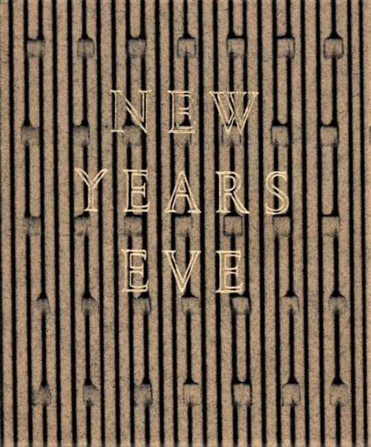
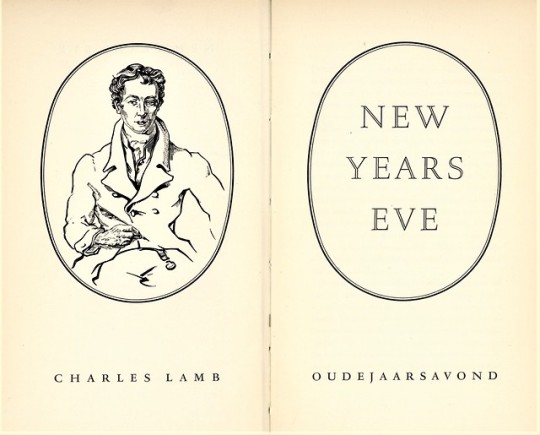
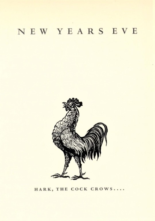
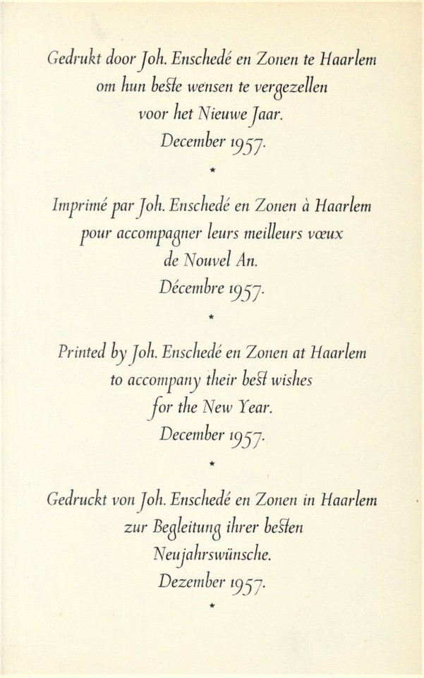
A New Year’s Eve Greetings
On this last day of 2018, we present a few images from a bilingual English/Dutch publication of Charles Lamb’s wistful essay New Year’s Eve in which he declares “I saw the skirts of the departing Year,” but is reticent to “Welcome the coming, speed the parting guest,” because he is “shy of novelties; new books, new faces, new years, from some mental twist which makes it difficult in me to face the prospective.” The essay first appeared in the January 1821 issue of The London Magazine, and was later included in in Lamb’s Essays of Elia in 1823.
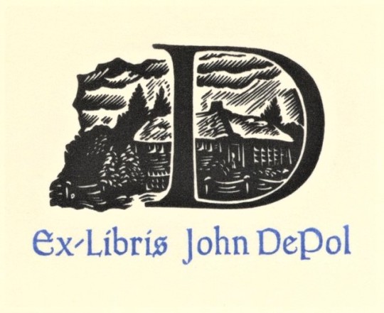
The edition shown here is a 1957 New Year’s keepsake printed in Haarlem by the noted Dutch type foundry of Joh. Enschedé en Zonen, founded in 1703 and still in operation today. The book was printed for friends of the type foundry in Romulus types designed by Jan van Krimpen and Molé Foliate capitals designed by S. L. Hartz, who also executed the portrait of Lamb for this book. Our copy, another gift from our friend Jerry Buff, is from the collection of the eminent American wood engraver John DePol, and bears his self-designed bookplate.
In his essay, Charles Lamb writes:
. . . the birth of a New Year is of an interest too wide to be pretermitted by king or cobbler. No one ever regarded the First of January with indifference. It is that from which all date their time, and count upon what is left. It is the nativity of our common Adam. Of all sounds of all bells . . . most solemn and touching is the peal which rings out the Old Year. . . . Another cup of wine . . .while that turn-coat bell . . . just now mournfully chanted the obsequies of 1820 departed . . . . And now another cup of the generous! and a merry New Year, and many of them, to you all, my masters!
View other posts on Enschedé publications.
HAPPY NEW YEAR!
#new year's eve#holidays#Charles Lamb#essays#Enschedé Font Foundry#Joh. Enschedé en Zonen#Jan van Krimpen#S. L. Hartz#John DePol#John De Pol#Jerry Buff#bookhistory#Enschedé
30 notes
·
View notes
Photo
not schöffer’s roman
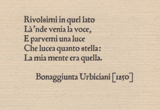
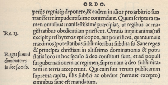
peter schöffer of gernsheim [1425-1503] was a scribe who apprenticed to the inventor of the black art, johannes gutenberg. schöffer united with gutenberg’s partner, johann fust, in legal proceedings against gutenberg resulting in «appropriation» of guntenberg’s printing apparatus; after which he married fust’s daughter, christina, & articled with fust in a new printing office—fust & schöffer. urbiciani’s poem [1st illustration*] prefaces a little book entitled Hand and Soul by dante gabriel rossetti [the halcyon press, maastricht, 1928]: it is set in types attributed to schöffer—which would have been amongst the first transalpine romans. the matrices descended schöffer’s family until jacobus scheffers, a printer at bois-le-duc [’s-hertogenbosch], sold them to johannes enschedé on 26 august 1768—enschedé used them only for study. the book is set in a fount cast by the historic firm of joh. enschedé en zonen, haarlem, in the early 20th c., from the restored material [ibid., colophon]. however, we learn from a.f. johnson: «One roman of this class has survived to our day, and is part of the wonderful collection of early types owned by Enschedé of Haarlem. In the specimen of this roman issued in 1926 they attribute it to Peter Schöffer of Mainz, and consider it to be the oldest type in their collection. It came to the Haarlem firm in 1768 from one Jacobus Scheffers, a printer at Bois-le-Duc, a descendent of the Schöffers. Their dating of the type is too early, but it is at least early sixteenth century. It is first found at Cologne in 1527.» [Type Designs, grafton & co., london, 1959, p.44]. johnson further directs us via footnote [ibid.] to A History of the Old English Letter Foundries by talbot baines reed (edition edited & expanded by johnson) who puts us firmly in the picture: «Thomas Berthelet, who succeeded Pynson as King’s printer in 1530, introduced two, or possibly three, new romans and an italic from Cologne, where there was an anonymous punch-cutter at work in the twenties, one of whose designs has survived to our generation. Whether he worked as an independent founder or was an employee of one of the leading Cologne printers, Quentel or Cervicorn, cannot be discovered. … The 88 roman [2nd illustration†] is found at Antwerp with J. Steelsius in 1539. This type seems to have some relation to Quentel’s roman first found in 1527, a type which has survived, at least in part.» [faber&faber, london, 1952, pp 87-8]. the textile research centre in leiden has an interesting page about peter quentel & his activity in 1527.
* printed letterpress on van gelder mould-made paper in the office of joh. enschedé en zonen.
† frank isaac, English & Scottish Printing Types 1535–58 * 1552–58, the bibliographical society, 1932, fig. 4.
#typography#letterpress#peter schöffer#poetry#bonaggiunta urbiciani#joh. enschedé en zonen#thomas berthelet#peter quentel#alfred forbes johnson#talbot baines reed
0 notes